
Rap Album Cover Ideas: Five Concepts You Can Turn Into a Brief
Your cover does not need to summarize every lyric. Pick one feeling from the release, then give it a subject, a setting and a visual rule. These five directions are starting points, not a ranking of trends or a promise that a particular style will sell.
Start with a sentence about the song
Finish this: “This release is about ___, but it feels ___.” For example: “This release is about getting home after a long night, but it feels restless.” That gives you something more useful than “make it look hard.” Choose one direction below that supports that sentence.
1. The interrupted portrait
Use it for: a personal release where the performer matters more than the setting.
Concept: a close portrait partly crossed by a doorframe or a strip of window light. Keep the expression visible; the interruption should add tension rather than hide the person.
Example brief: Square cover for a fictional release called “Last Train.” A tired performer beside a late-night carriage window, close framing, blue ambient light and one warm reflection. Leave a quiet area at the upper left for separately added title text. No logos or imitation of another artist's cover.
Tradeoff: the face can carry the image, but an overly tight crop leaves nowhere for words. Compare a tight and a wider crop before choosing. If using your own photo, start with the photo-to-cover workflow.
2. One ordinary object with a story
Use it for: a track built around absence, an unfinished conversation or a specific memory.
Concept: one object that has meaning in the lyrics: a folded receipt, an empty chair or a key. Give it enough space to become the focus. An object is more distinctive when it comes from your story rather than a generic luxury checklist.
Example brief: A single house key on a scratched kitchen table at dawn. Long side shadow, muted grey-green palette, overhead square composition. No extra objects, no printed words, no people. Reserve the lower third for a small release title.
Tradeoff: a subtle object may disappear at thumbnail size. Enlarge the main shape or simplify its surroundings; adding more props can weaken the idea.
See what disappears at thumbnail size
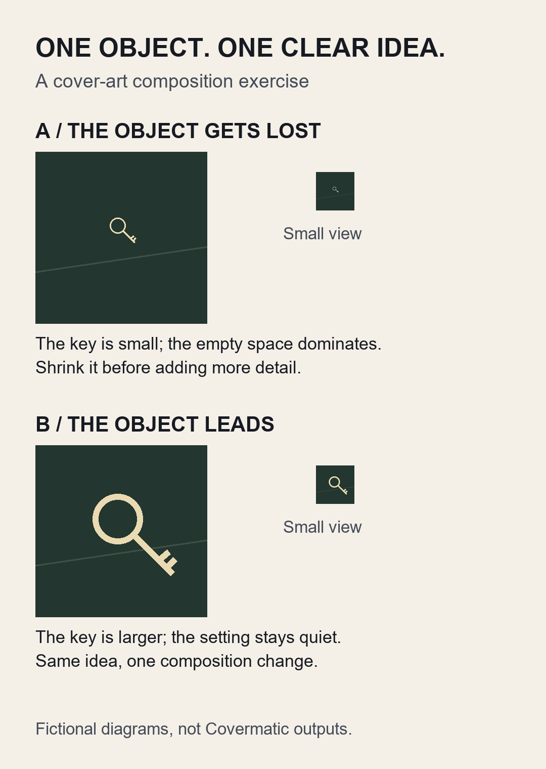
These are fictional composition diagrams, not Covermatic outputs or finished release covers. In A, the key gets lost when reduced. In B, one change makes the key easier to identify. A smaller object may still suit a song about isolation; choose what supports your story.
Try it before another attempt: shrink your draft, name what you notice first, and change one thing. If the important object disappears, enlarge it or simplify the surroundings. Add final typography separately and inspect the full-size export.
3. A place after everybody leaves
Use it for: reflective, nocturnal or place-specific music.
Concept: an empty location that implies something just happened. A closed takeaway counter, a stairwell or a quiet parking lot can give the cover a world without a crowded collage.
Example brief: Empty neighbourhood basketball court after rain, one lit hoop, wet dark ground and an amber streetlamp. Wide square view, restrained colour, strong silhouette. No readable signs, brands or people. Keep a calm strip of sky for typography.
Tradeoff: atmosphere alone can become anonymous. Choose one detail linked to the release and keep it visible. Use a real location reference only if you can use that reference appropriately.
4. A deliberate collision of two materials
Use it for: a song about conflict, pressure or two sides of the same person.
Concept: contrast something rough with something polished. For example, a torn paper edge against a smooth glass surface. Make the contrast the concept; avoid piling on smoke, chrome, flames and extra symbols.
Example brief: A torn matte-black paper shape against pale frosted glass, one diagonal split, limited black-and-cream palette, clean square composition. One texture contrast, no lettering or logos. Leave space for a short title in a separate design pass.
Tradeoff: fine texture may vanish when reduced. The large shapes must still work without it. These are suggested visual materials, not a claim that every generator will reproduce them precisely.
5. Words as the main image
Use it for: a short, memorable release title that deserves the focus.
Concept: build the design around the title and one controlled accent. Set the final words in a tool where you can inspect their spelling and spacing; do not rely on generated lettering being correct.
Example layout: “NO SIGNAL” on two lines, large cream letters on a dark background, one thin interrupted red line. Artist name small but readable. Keep enough edge space that the letters do not feel accidentally cut off.
Tradeoff: a long title needs a different layout. Avoid shrinking every word just to fit. Try a different line break or choose an image-led direction instead.
Turn one idea into a usable brief
- Feeling: choose one emotional contrast, such as confident but isolated.
- Subject: choose one face, object or place.
- Composition: decide what dominates and where the title goes.
- Palette: choose a small set of colours that supports the music.
- Exclusions: say what should not appear, including unwanted text or brands.
Change one major decision at a time. If you change the subject, palette, crop and lettering together, you will not know which change improved the cover.
Check the actual cover before release
Look at the saved image full size, then small. Can you identify the main idea? Does the title still read? Is the artist name spelled correctly? Thumbnail size is a design check, not an official distributor specification. Check the submission route separately using the release-artwork checklist.
These examples are fictional design exercises. They are not generated results, customer examples or evidence of improved streaming performance.
Try the direction you can explain most clearly
If you want to explore an image-led direction, bring the subject, mood, palette and exclusions into Covermatic Studio. Inspect the result before spending another attempt. Generations and edits currently use five credits per attempt; buying credits does not guarantee a finished or distributor-approved cover.
Leave a comment: